ESCALFADO
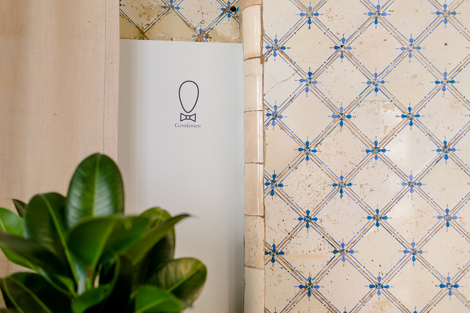
Escalfado is a small brunch cafe in the charming Santos neighbourhood that feels like a hidden gem. The architecture of the place is charismatic and classic-turned-minimal, with hues of petrol blue and millennial pink topped with wonderful handmade ceramics and old marble walls.
We worked around this colour scheme and its name (it means poached) and ended up designing an identity we would call contemporary-classic.
The “O” on the logo was turned into an egg and it paired with an egg icon and classic serif typography. A speckled egg shell pattern also complements some of the various collaterals.
For Escalfado we designed the various menus, business cards (with a cute embossed egg), windows, some pins for the uniforms, all the custom signage, packaging for the takeaway drinks and a simple landing page.